
Barley Institute
Packaging
Barley Institute
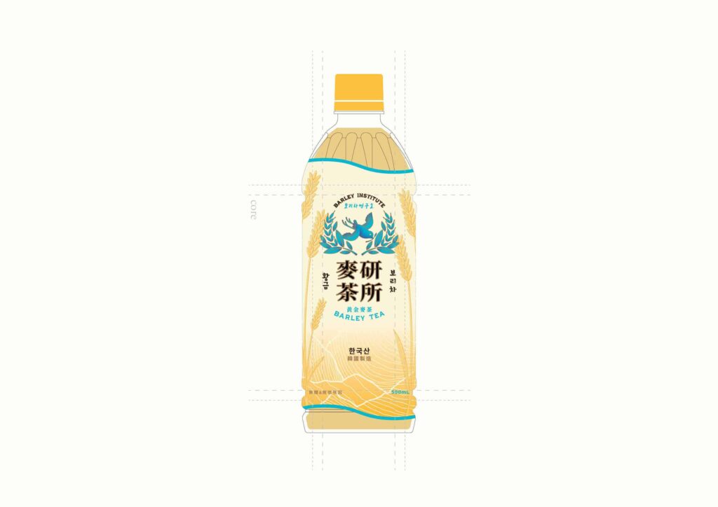
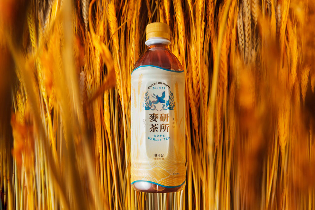
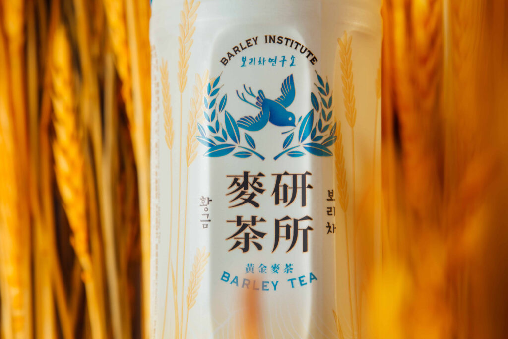
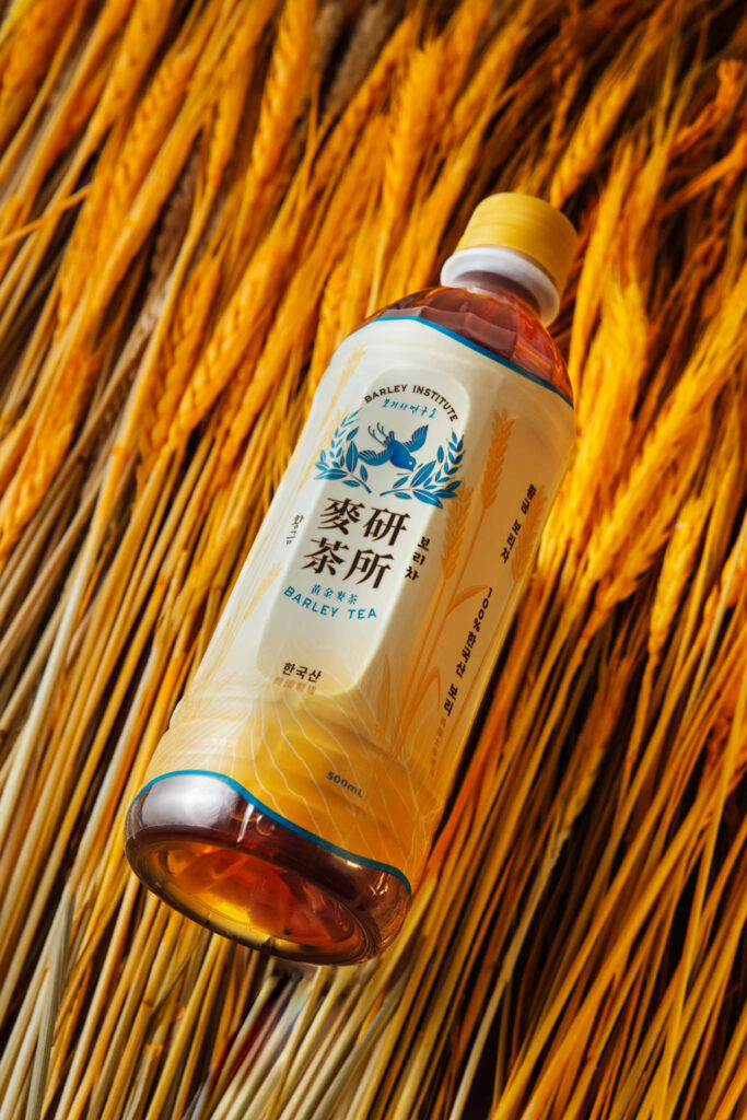
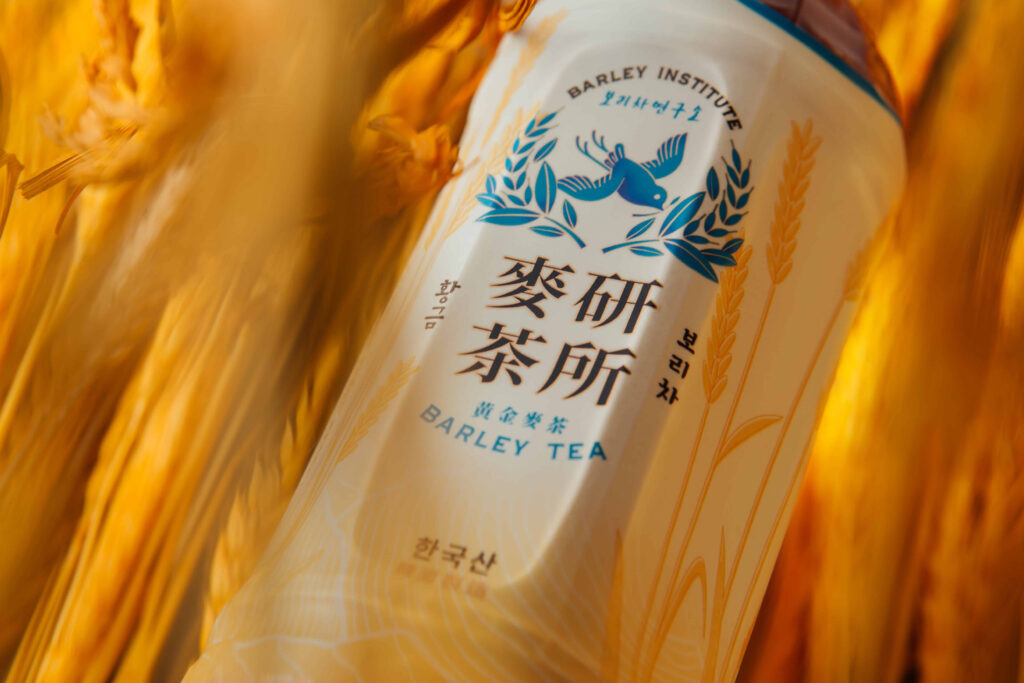
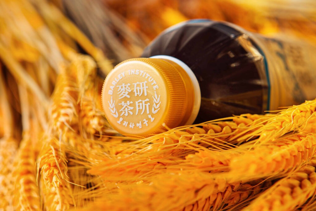
For the packaging design, I used beige as the main colour tone for Barley Institute Barley Tea. Furthermore, I added a texture for the barley illustration, so the roasting and barley taste of the product is more outstanding.
I used gold and sky blue on the design, which added a feeling of elegance and premium. The sky blue also added a natural sense to the product.
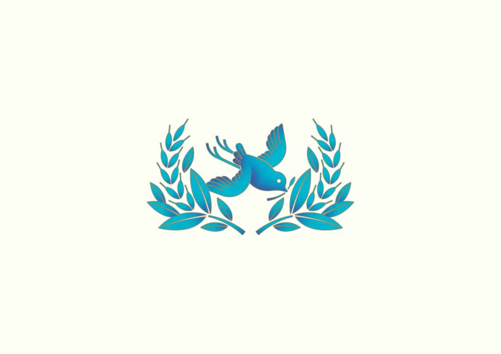
Blue cuckoo has the meaning of “happiness” and “luck”. A blue cuckoo holding a barley means the golden harvest time has arrived, and the cuckoo is bringing the perfect moment of barley to people.
Photo
Photo
Photo
Photo
Photo
Photo
Photo
Photo
Photo
- Credits
- → Client: 麥研茶所 BARLEY INSTITUTE / → Creative Director: Vince Cheung @ Vincdesign / → Design and illustration: Kaman Kan / → Photography: Yin Ip @ tinysotiny.co
Photo
Photo
Photo