Hashtag B
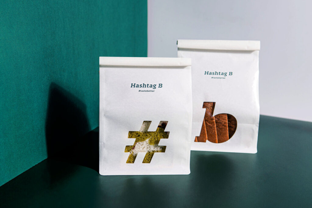
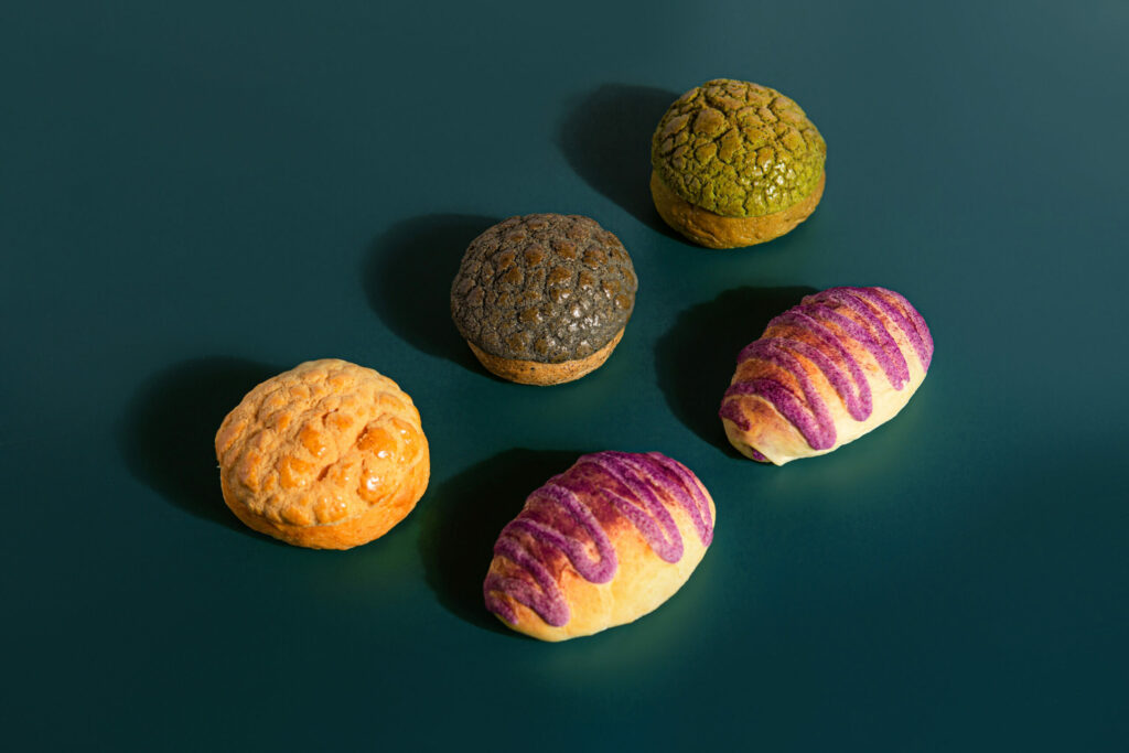
Hashtag B is a local bakery brand that redefines Hong Kong-style baking. Dedicated to inventing flavours of bread that impress the city, Hashtag B upholds the principle of health in its creation. The brand selects exclusively organic ingredients and uses sugar and salt in the most minimal way. Artificial colouring and preservatives are also never found in their products. Hashtag B hand-makes their batches everyday for customers to enjoy their baked goods fresh from the oven.
Photo
Design Solution
B for Bakery; B for Bread; B for Better, B for Believe.
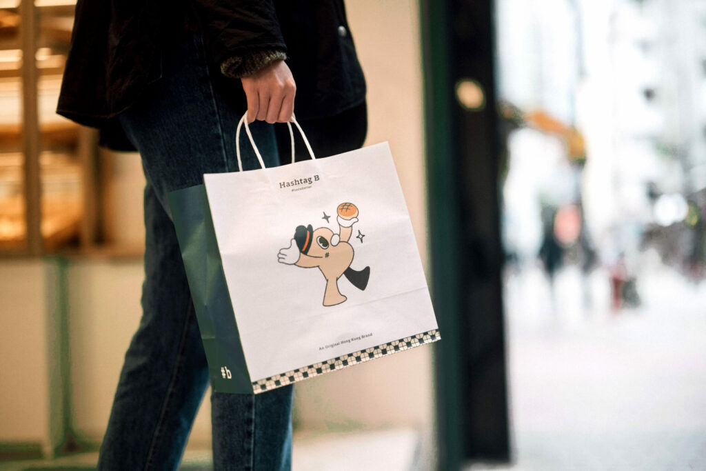
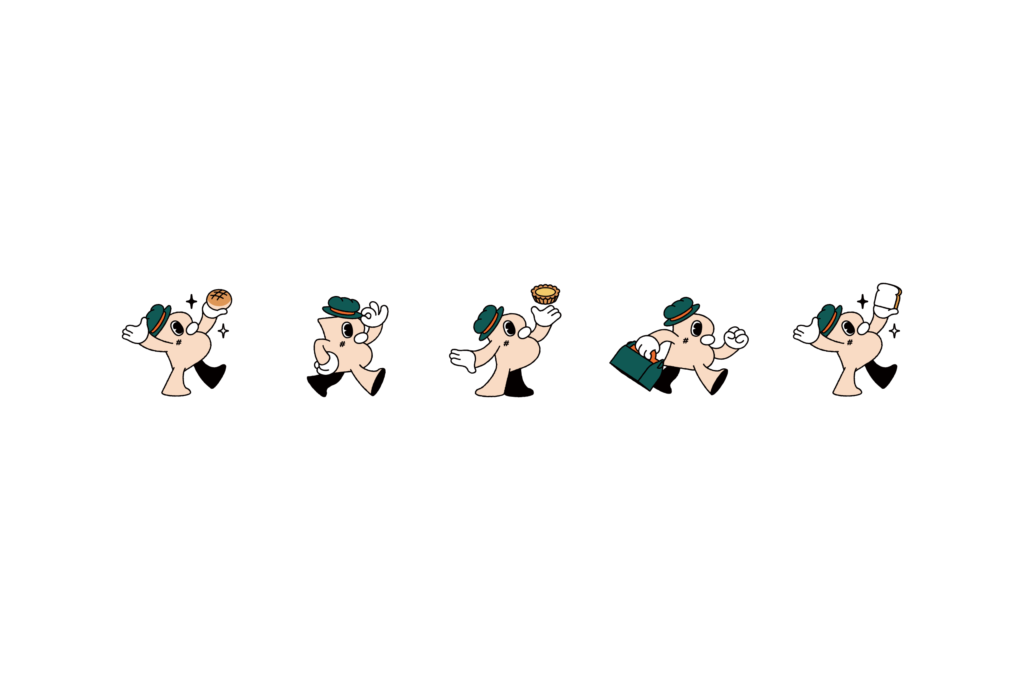
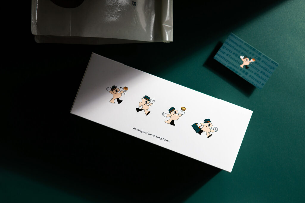
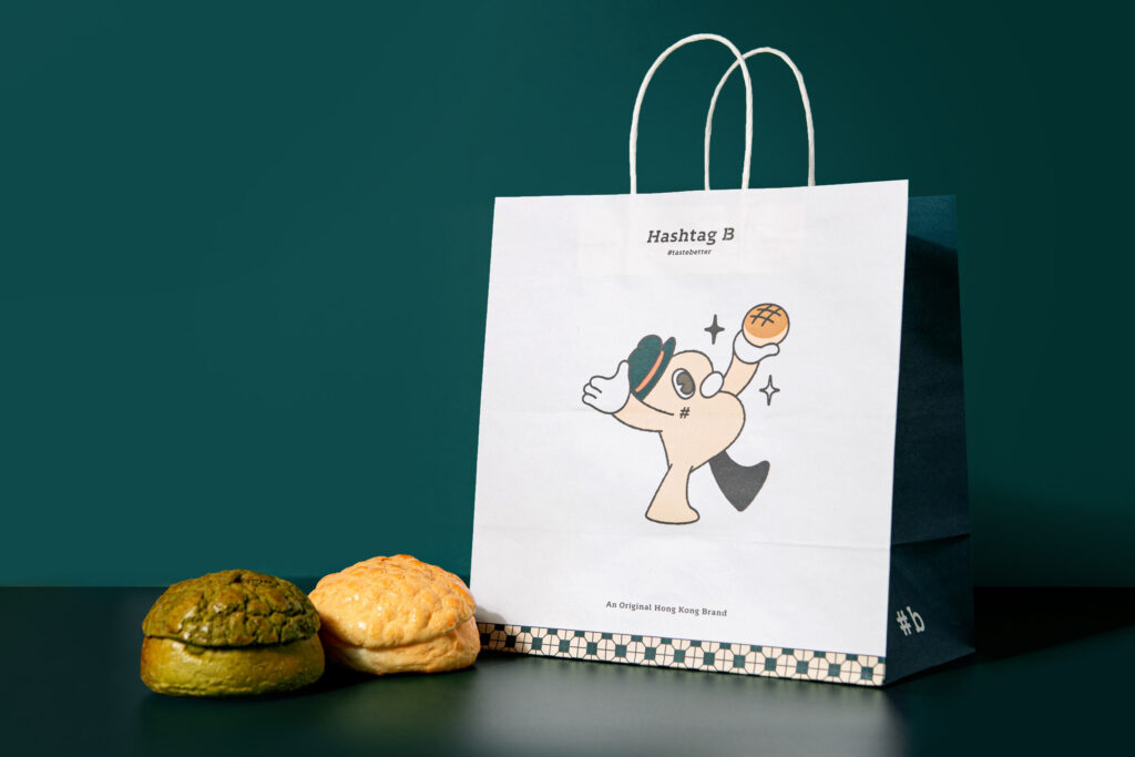
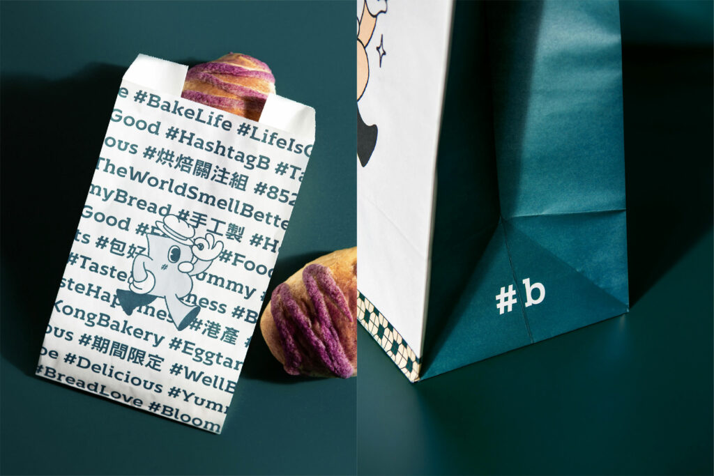
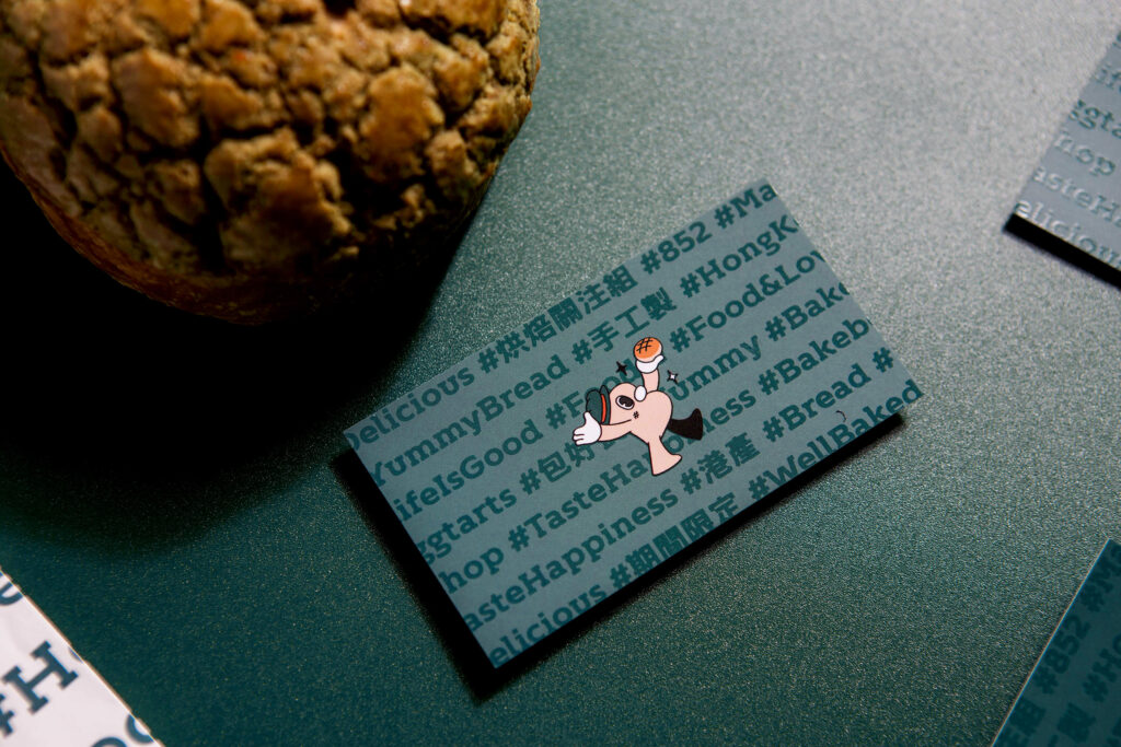
Hashtag B is more than a brand name, it also carries the brand’s high hopes for Hong Kong-Style baking. The brand’s Super Graphics feature a quirky gentleman named Mr. B, who embodies the brand’s promise of using high-quality natural ingredients and handcrafting their baked goods daily. Mr. B is brought to life with his signature top hat, while the sparkles in his eyes symbolize Hashtag B’s creativity and dedication to fusing local flavors and delights.
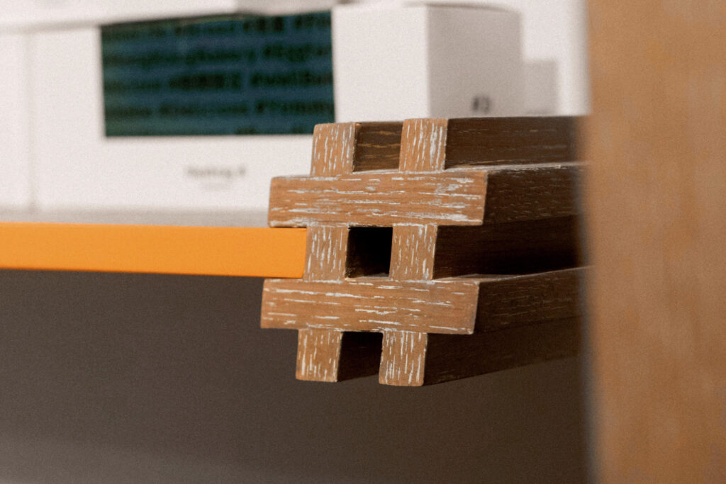
The Super Graphics also feature a Hashtag Wall, which highlights the Hong Kong trend of using hashtags. This design element adds an aesthetic touch to the brand and reinforces its theme of innovation and modernity. These design elements combine to create an energetic and reliable profile for Hashtag B.
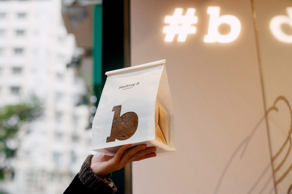
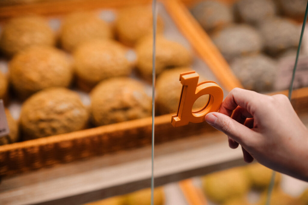
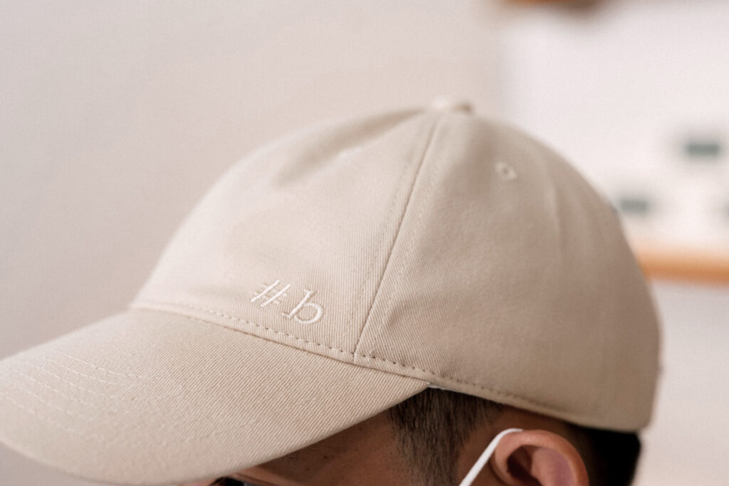
The brand’s logo features a clean and simple design with the letter “B” as the main focus. The tagline “#TasteBetter” is written underneath in bold sans-serif font that is easily recognizable. The use of color in the logo symbolizes warmth and excitement, which are essential elements for a bakery brand.
One unique aspect of Hashtag B’s branding design is its use of social media to connect with customers. The brand has a strong online presence and regularly updates its social media pages with new products, events, and promotions. This approach allows the brand to engage with customers in real-time and build a loyal following. Hashtag B also uses hashtags on its social media posts to encourage customers to share their experiences and engage with the brand.
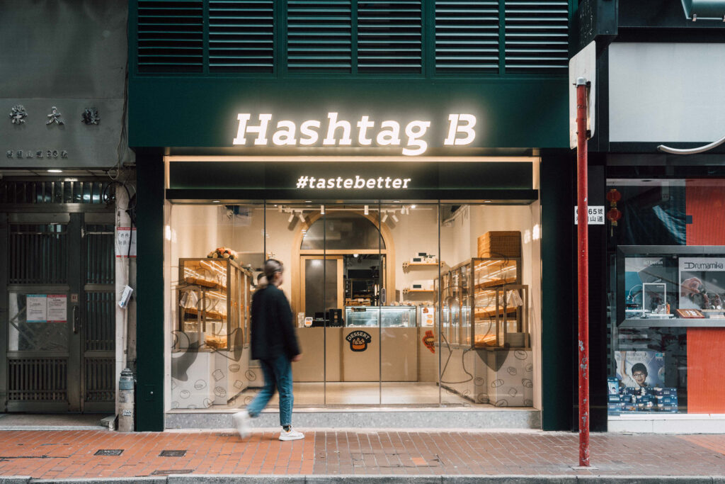
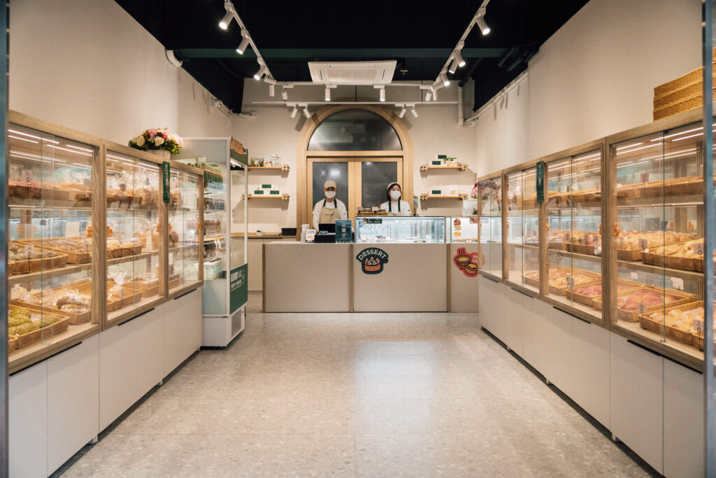
Hashtag B’s branding design extends beyond its digital presence to its physical storefronts. Each location across Hong Kong features the brand’s Super Graphics and unique design elements. The storefronts are designed to be warm and inviting, with a modern and minimalist aesthetic that reflects the brand’s commitment to innovation.
The success of Hashtag B’s branding design is evident in its popularity among Hong Kong locals and tourists. The brand has managed to stand out in a competitive market by staying true to its philosophy of using organic ingredients and handcrafting its baked goods daily. Hashtag B’s commitment to innovation and modernity is reflected in its branding design, which has helped the brand build a loyal following and establish itself as a leader in Hong Kong’s baking scene. Altogether, VINCDESIGN’s inspirations complete an energetic and reliable profile for Hashtag B.
Photo
Photo
Photo
Photo
Photo
Photo
Photo

Photo
Photo
Photo
Photo
Photo

Photo
Photo
Photo
Photo
Photo
Photo
Photo
Photo
Photo
Photo
- Credits
- → Client: Hashtag B / → Creative Director: Vince Cheung @ Vincdesign / → Design and illustration: Kaman Kan & PingTing Lee / → Interior Design: Jeffrey Shum & Rex Fong @ Brevity Studios Limited / → Photography: Yin Ip @ tinysotiny.co u0026 Eddie Li @ tinysotiny.co
Photo
Photo
Photo
