Jockey Club Contemporary Art Literacy
and Appreciation Programme
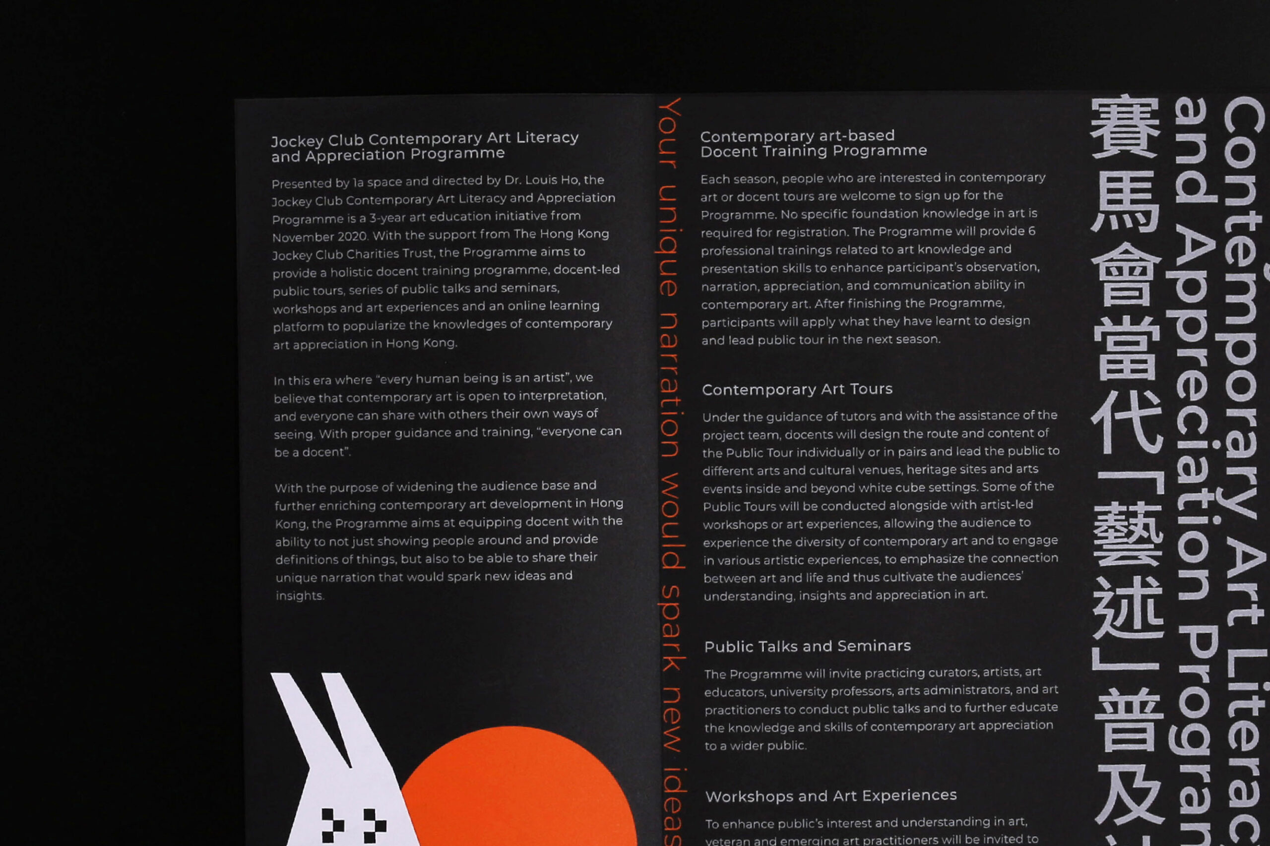
In this era where “every human being is an artist”, JCCALAP believes that “everyone can be a docent”. With holistic docent trainings, docent-led public tours, seminars, etc., JCCALAP aims to popularise the knowledges of contemporary art appreciation in Hong Kong.
Photo
Solution
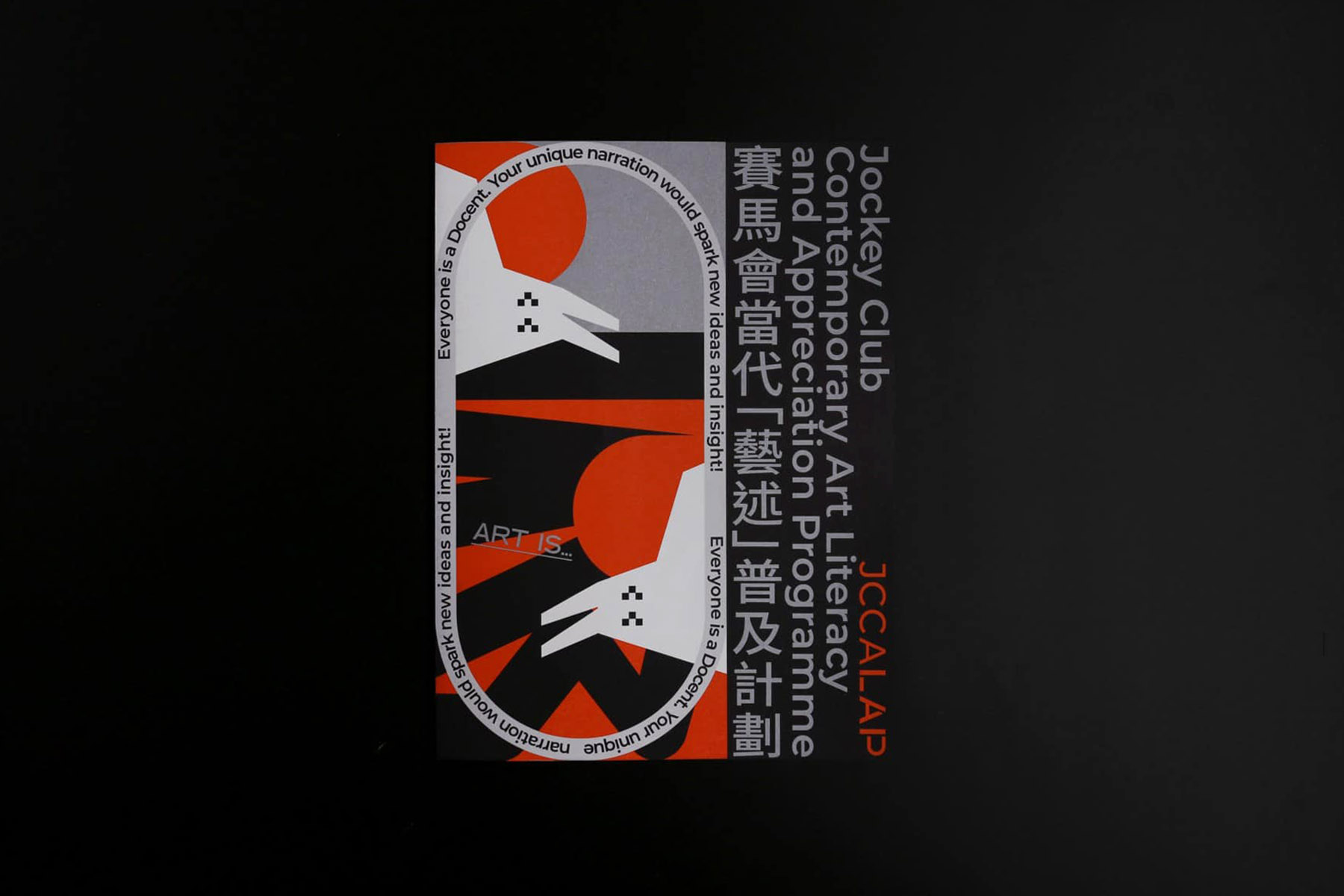
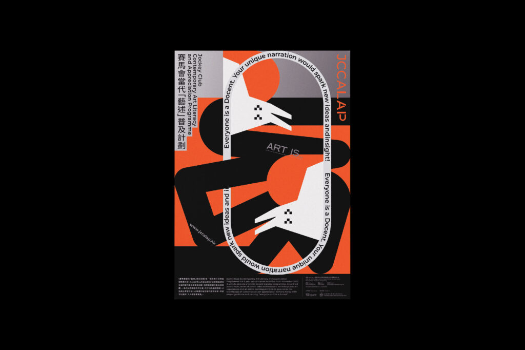
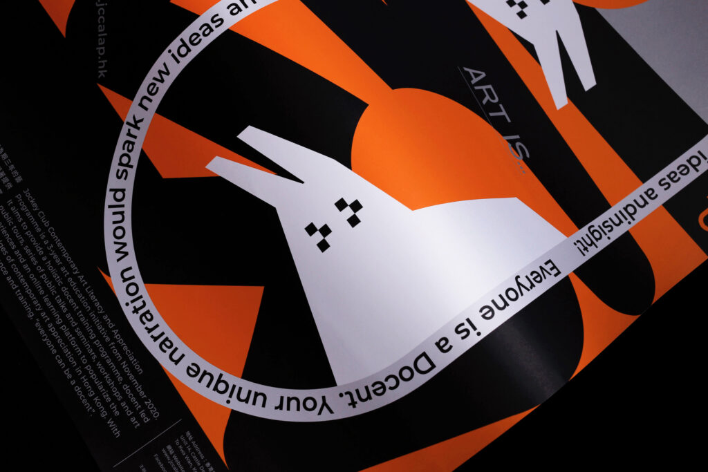
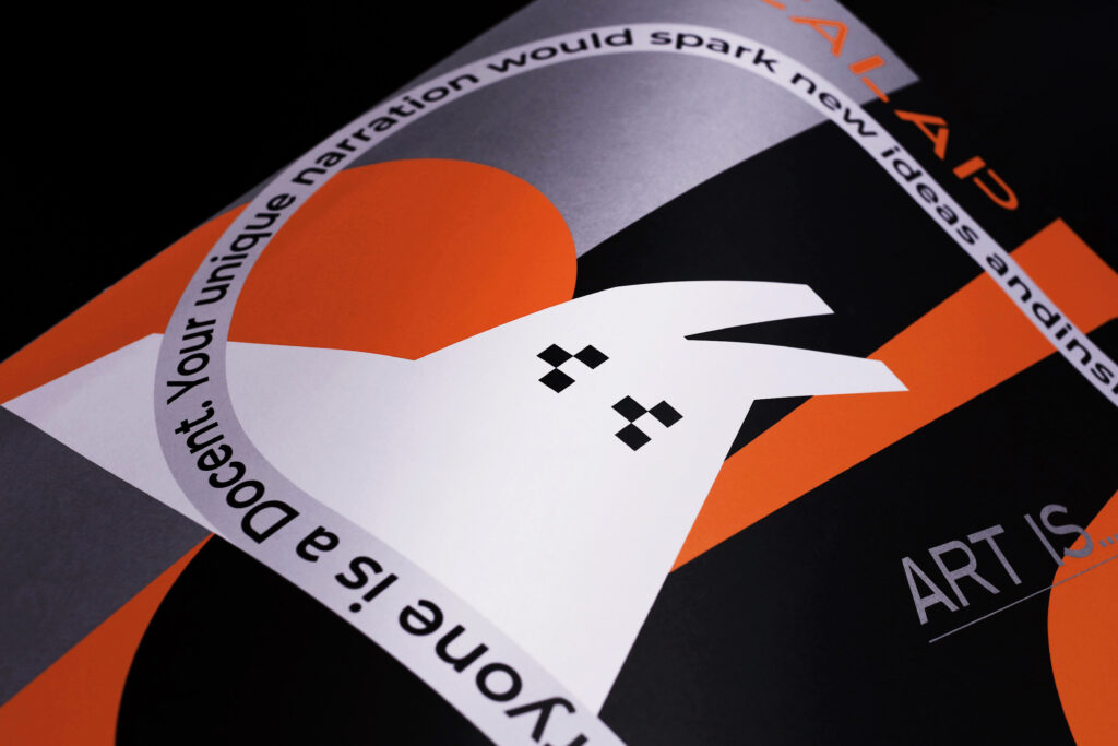
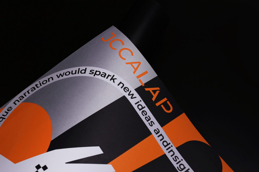
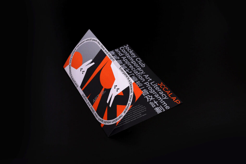
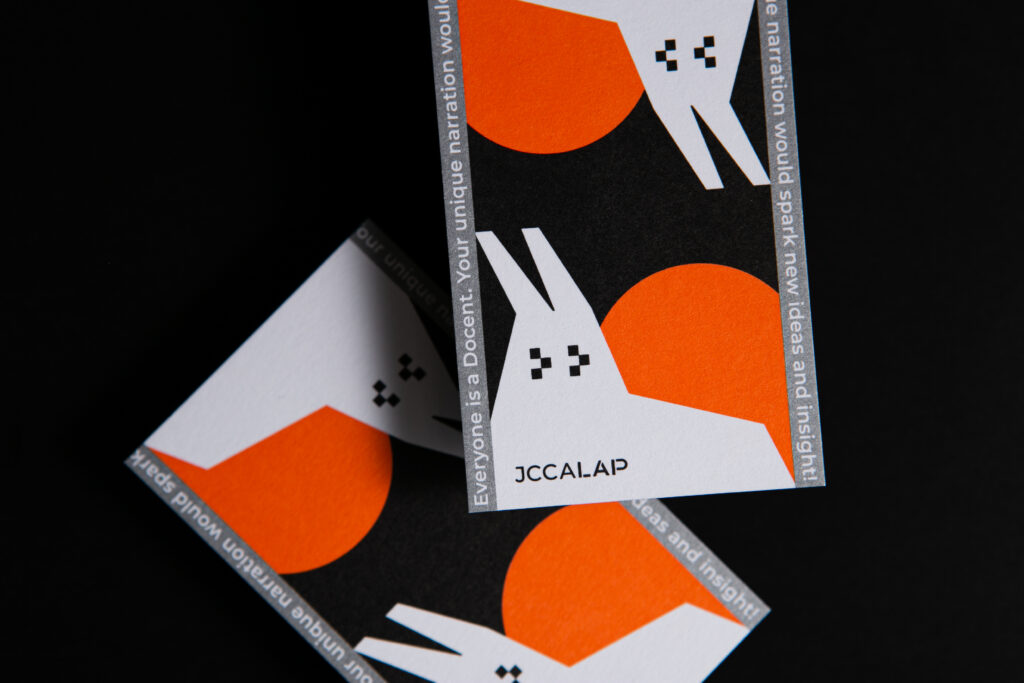
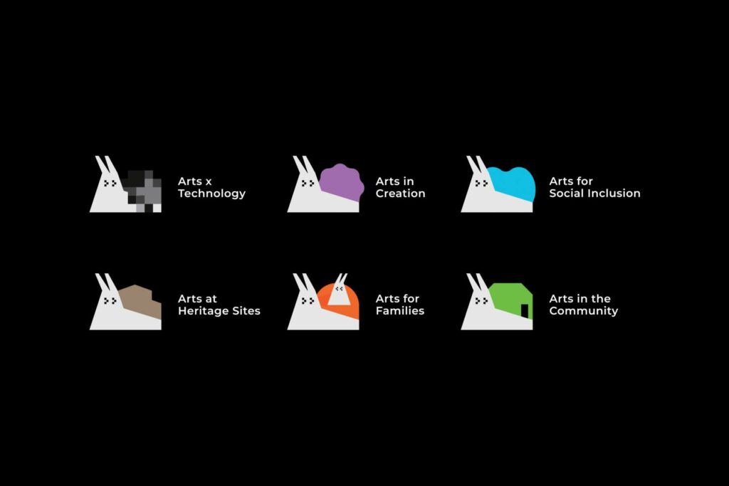
To make the programme more lively and recognisable, we chose a little character for it, a snail. You may think of “slowness” at the moment you see this character. However, JCCALAP exactly wants everyone to learn from a snail, to enjoy and reflect on art slowly. Also, a snail leaves traces wherever it goes, just like JCCALAP walks through and leaves traces in the art-learning-journey with you.
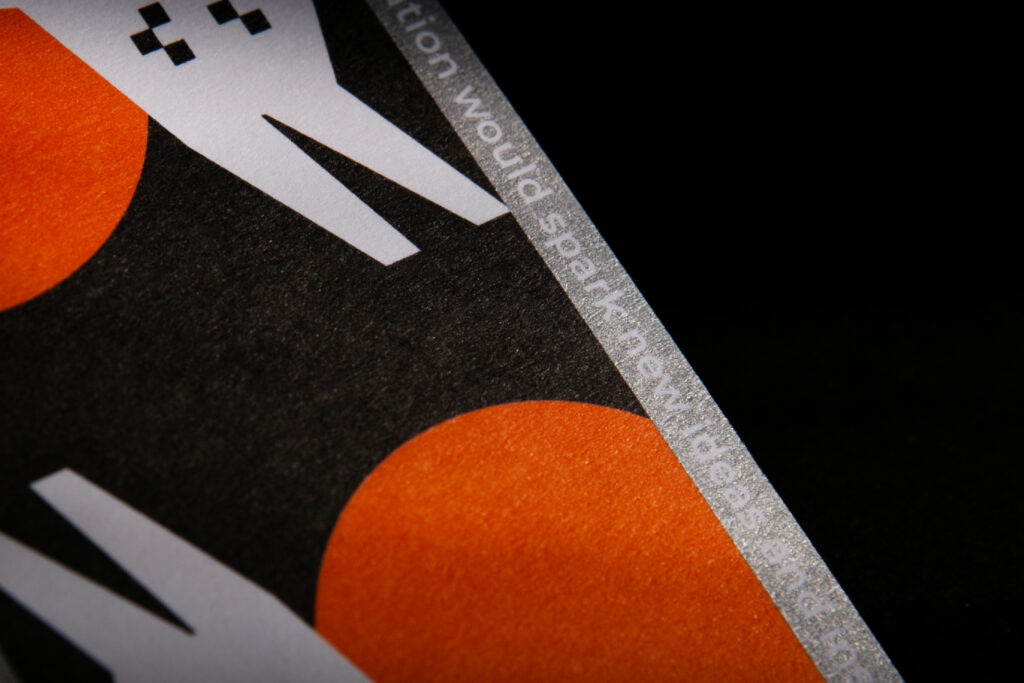
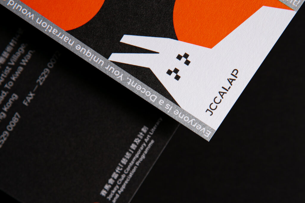
Colour combination is very essential to a brand. We used orange as the main colour, which is energetic and also the representative colour of the organiser 1a space. Black, grey and white as supporting colours, representing different form of arts. The visual identity is formed by random strokes and a clear lap, showing that with JCCALAP, everyone can find their own clear path in the seeming messy world of art.
Photo
Photo
Photo

Photo

Photo
Photo
Photo
Photo
Photo
Photo
Photo
Photo

Photo

Photo
Photo
Photo
Photo
- Credits
- → Client: 1a space / → Creative Director: Vince Cheung @ Vincdesign / → Design and illustration: Kaman Kan / → Photography & Animation: Yin Ip @ tinysotiny.co
Photo
Photo
Photo


