FARMACY
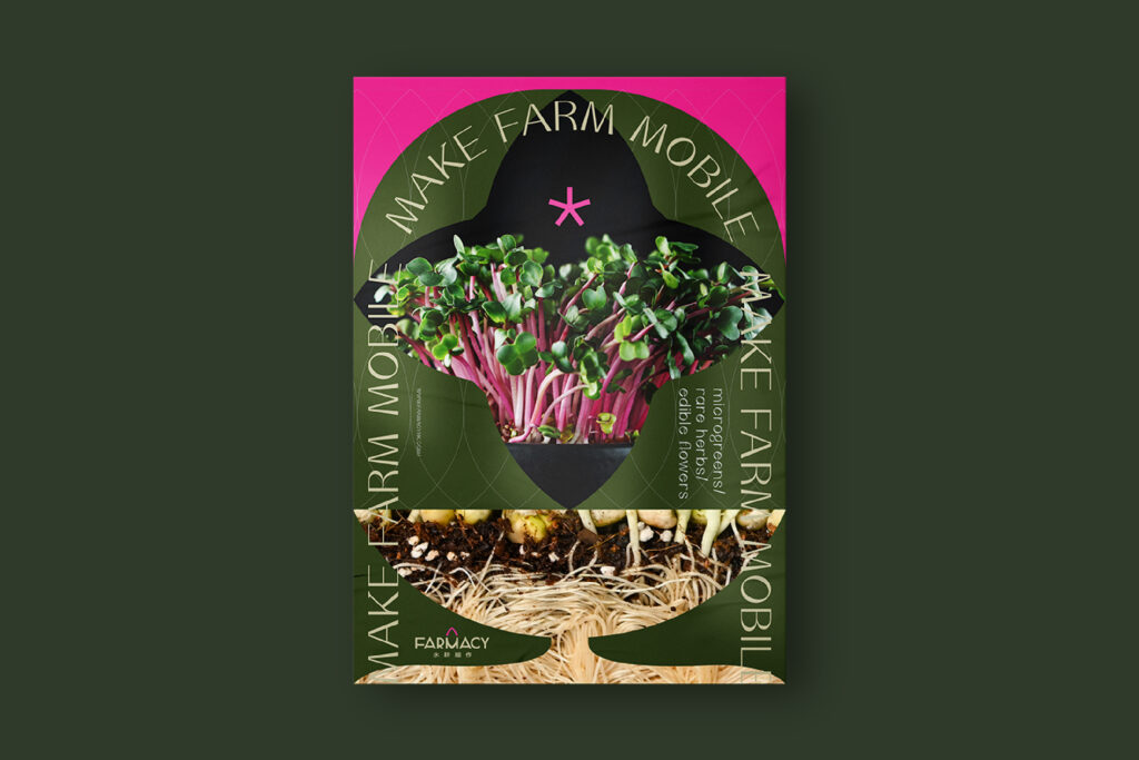
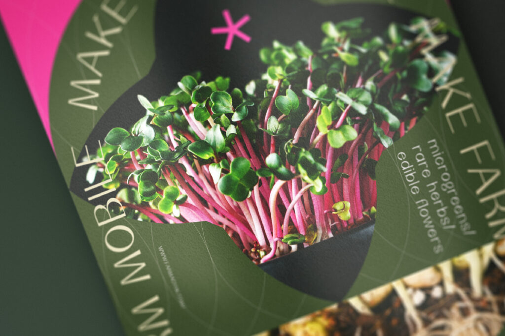
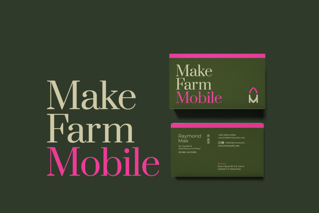
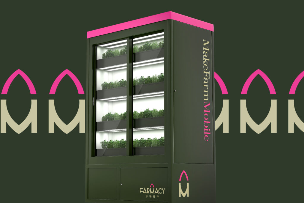
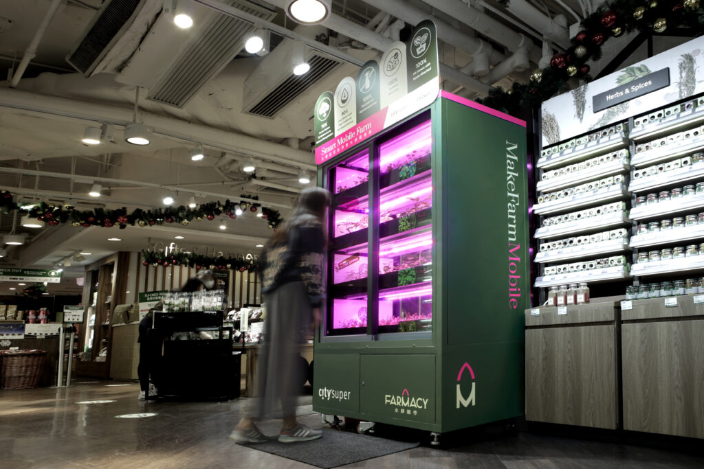
The new brand colour palette of Farmacy is green + pink. While green represents plants and pink represents the glowing light, such colour combination implies that Farmacy tries to break the rules, creates the Asia’s first mobile in-store farms. Such eye-catching colour combination is also helpful when Farmacy starts its B2C business model, helps it gain more recognition.
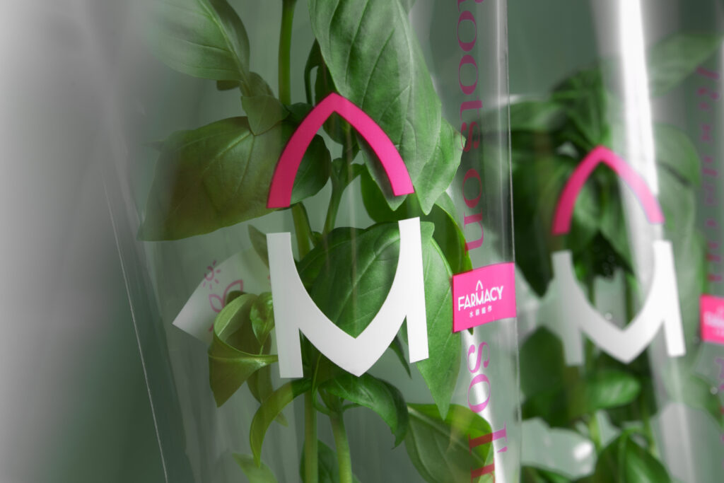
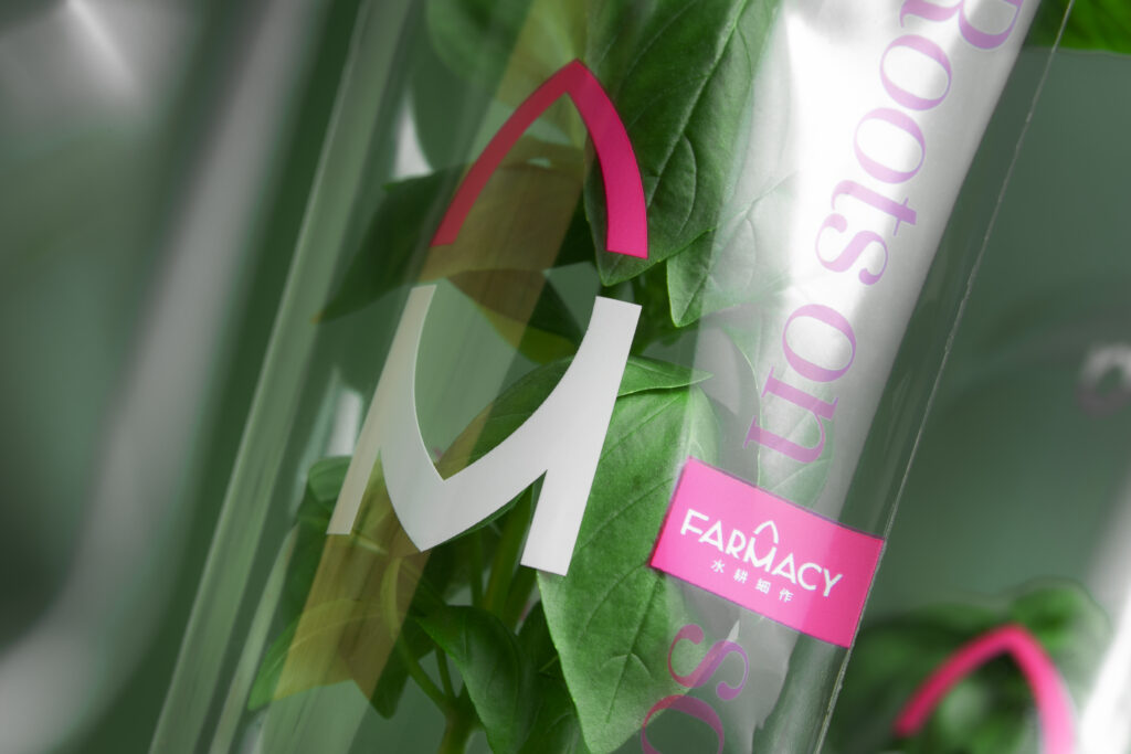
Farmacy is not limited by space or location. Because this “mobile” feature is the biggest difference between Farmacy and other in-store farms, we emphasise “mobile” in the logo, and also bring out the brand concept: “Make Farm Mobile”, that people can enjoy fresh vegetables anywhere, anytime. We created a leaf image on top of “M”. The “M” together with the leaf, creating a rocket image, symbolising that the dynamic and rapid growth of the plants and the brand.
Instead of friendly, we believe a more global and professional identity will suit Farmacy and its exquisite products better. We want the visual identity show people a sense of technology, and the premium quality of the products.
Photo

Photo
Photo
Photo
Photo
Photo
Photo
Photo
Photo
Photo
Photo
- Credits
- → Client: FARMACY 水耕細作 / → Creative Director: Vince Cheung @ Vincdesign / → Design and illustration: Kaman Kan / → Photography: Yin Ip @ tinysotiny.co
Photo
Photo
Photo
