LifeLab NMN
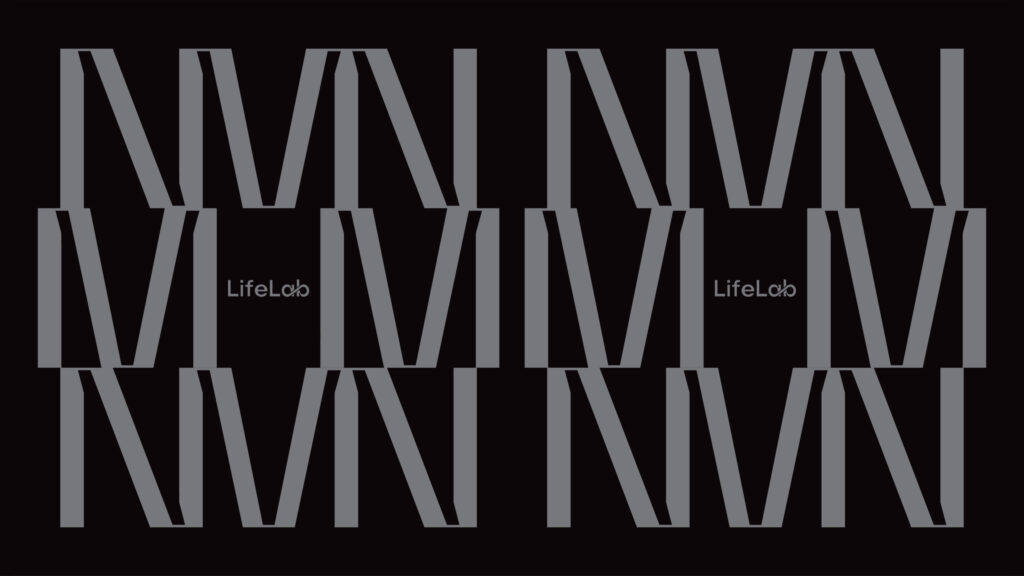
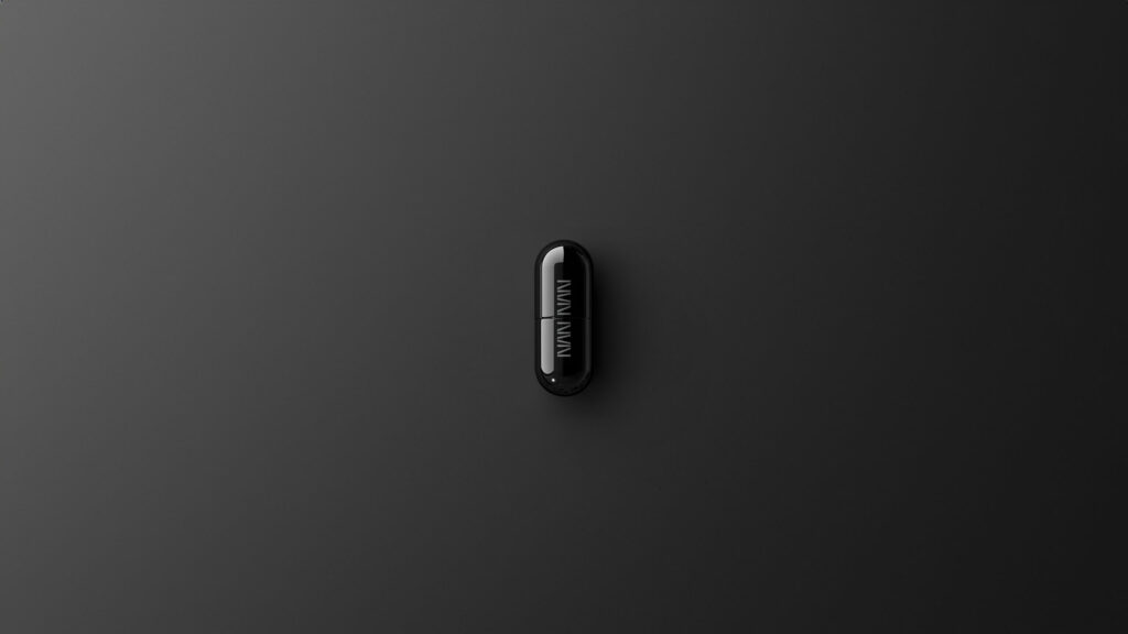
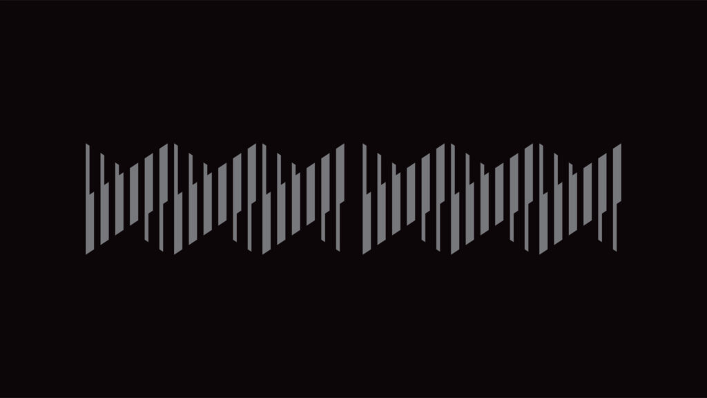
The branding concept for LifeLab’s NMN supplement is modern and high-tech and is based on DNA imagery in reference to its reported DNA repair and maintenance abilities. To achieve this, a contrasting color palette of black and silver is used and the design direction emphasizes sleekness and clarity.
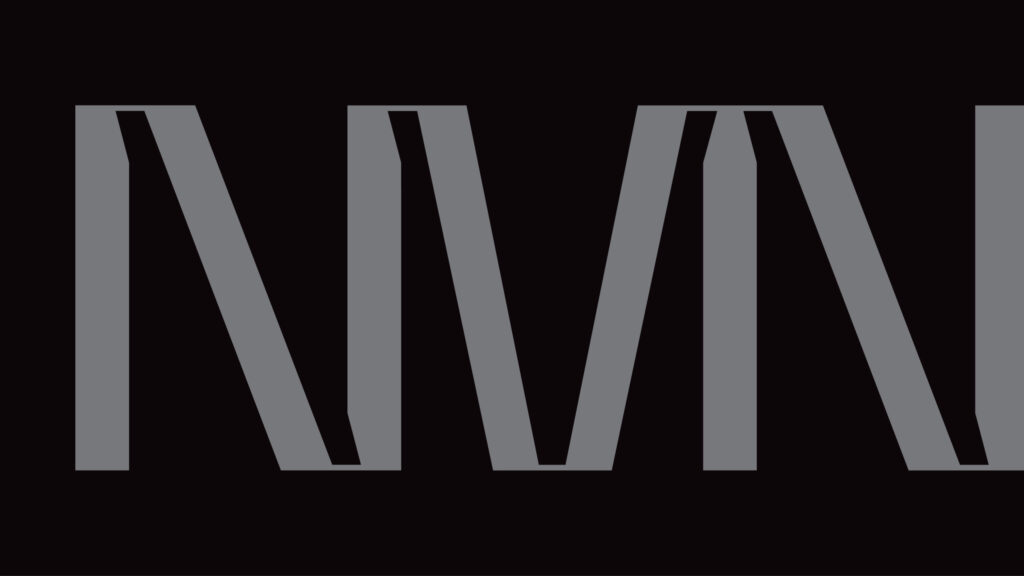
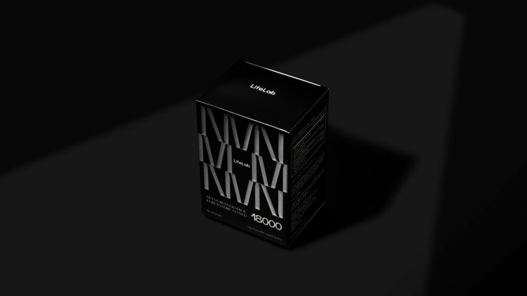
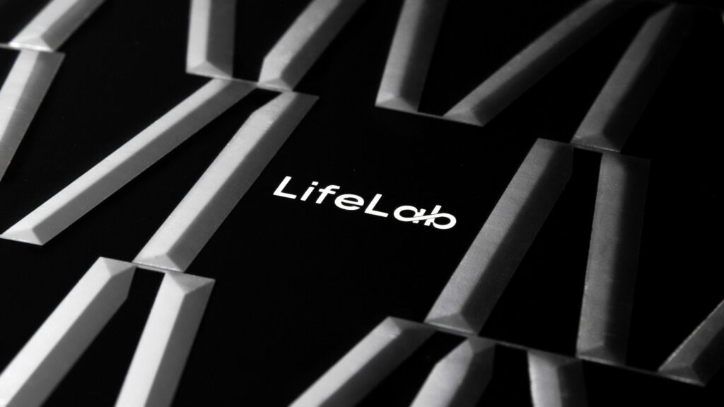
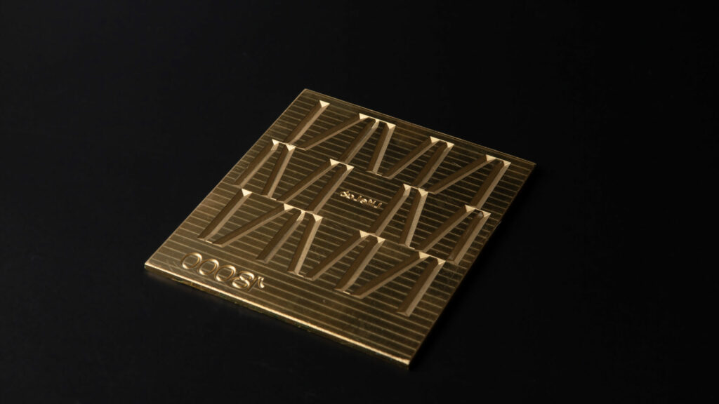
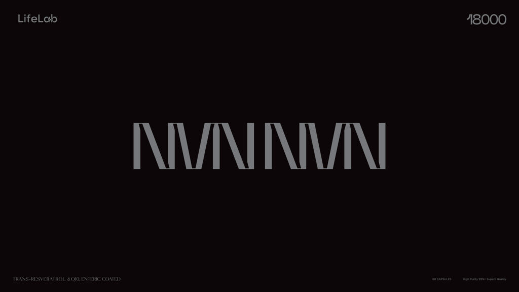
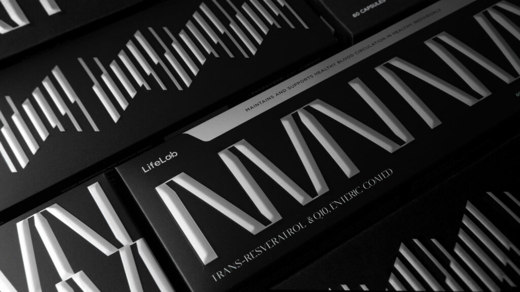
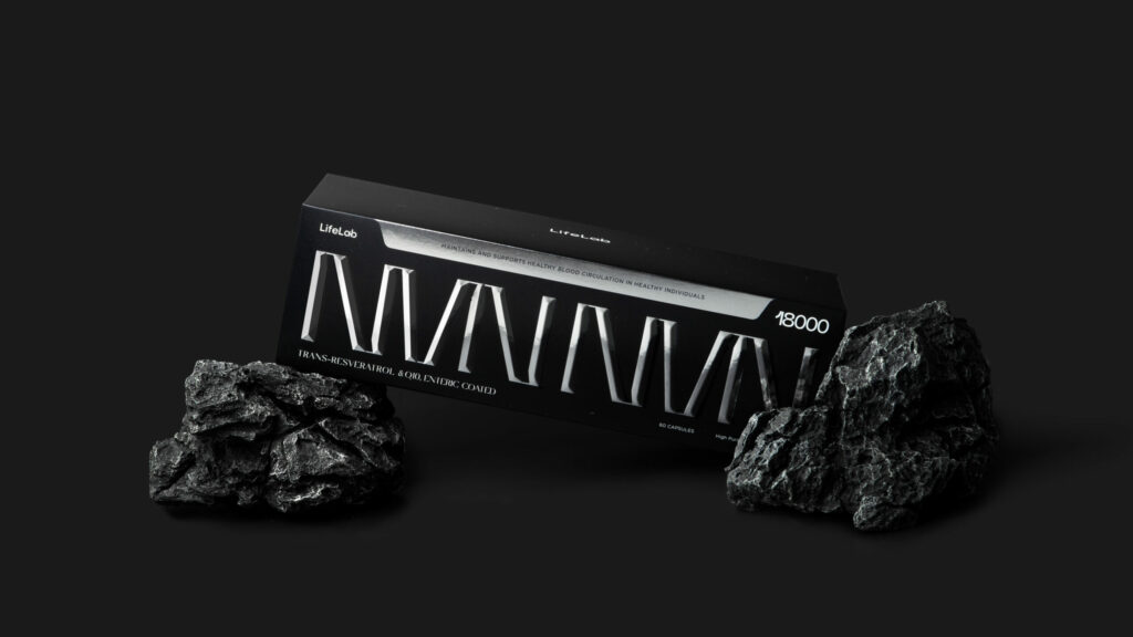
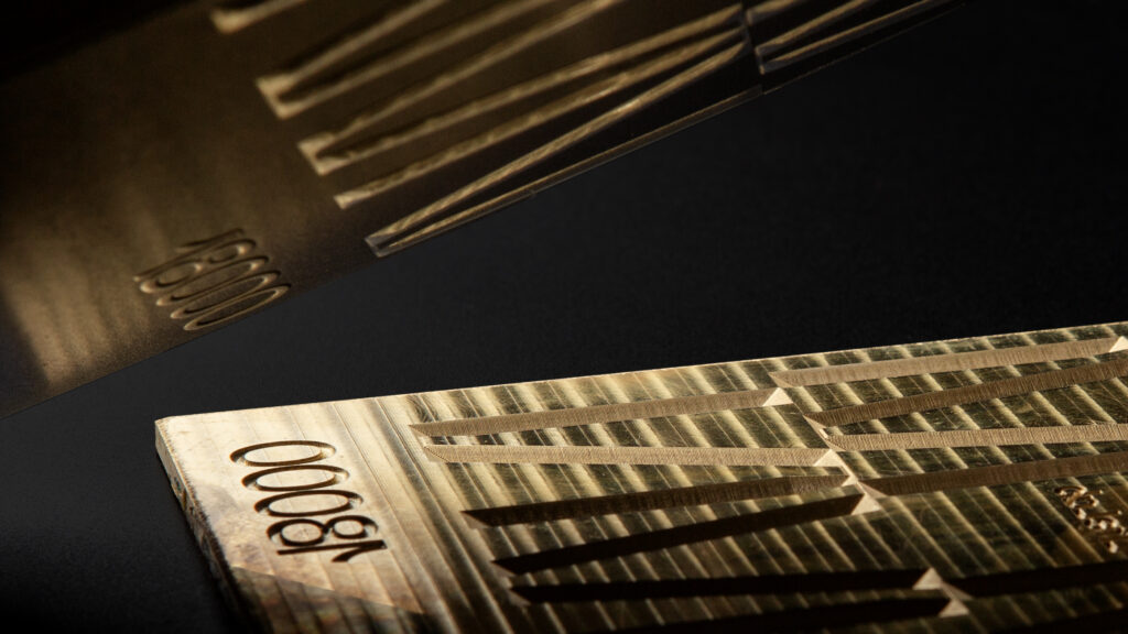
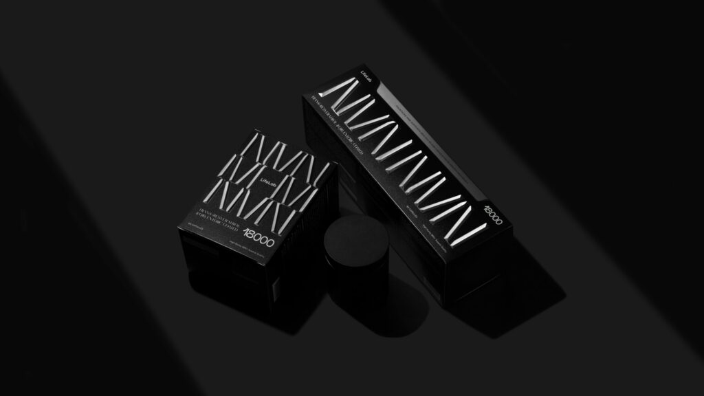
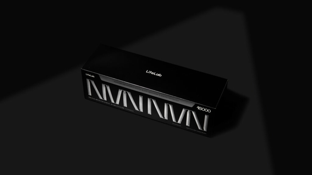
For the box packaging, the box features a dynamic repeating pattern using a typography design that makes up the embossed letters ‘NMN’ in an eye-catching silver that contrasts against the black background. This pattern is carried on into a design that references DNA’s double-stranded helix. To evoke a sense of luxury, the box was designed to be a textured satin with a subtle glowing shimmer. This was achieved by using silver paper and printing the black background colour on top. Prominently displayed alongside the pattern is the supplement dosage, a crucial factor for consumers’ purchasing decision.
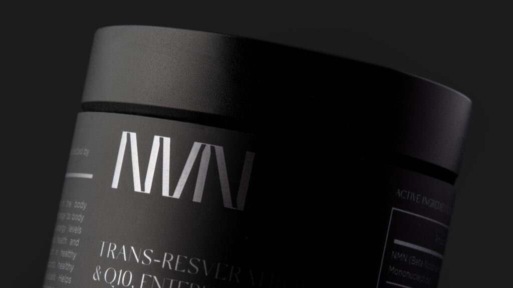
The product packaging maintains the sleek and modern aesthetic through the use of a satin black jar adorned with a label that spans the entire container. The ample label space allows for relevant and important information to clearly be presented to the consumer and the dark jar places the focus on the product while ensuring that the product is protected from direct light.
As seen on the packaging, LifeLab’s logo incorporates an infinity symbol representing the company’s mission and expertise in the field of regeneration and rejuvenation sciences. This emblem underscores LifeLab’s continuous commitment to pushing the boundaries of scientific exploration and enhancing the quality of life through innovative health solutions.
- Credits
- → Client: LifeLab NMN / → Creative Director: Vince Cheung@Vincdesign / → Design and illustration: Kaman Kan / → Photography: Justin Tsao
